A Post-Jam Update and Postmortem
It's been almost a week since the end of the rating period for the 2024 GameDev.tv Game Jam. I spent the past week working on The Wizard Tower as well as reflecting on the game jam itself. This was the first time I've ever participated in a game jam, and I honestly didn't know what to expect. I didn't even know it was occurring until about a week before the jam began! I am so glad I decided to join because it was a great experience.
In this devlog, I'll go over my experience participating in the jam and the changes I made to the game in the post-jam update. This is a long post, so please feel free to skip to the "Post-Jam Updates" section at the end if you'd like to see only the changes.
The Submission Period
Planning
The jam's theme of "Last Stand" had me thinking back to all the last stand moments that I remembered in the video games I've played. My first plan was to create a game inspired by The Fall of Silvermoon, chapter 5 of the Undead campaign of Warcraft 3: Reign of Chaos. The player would assume the role of a runner sent to find help for a beleaguered company of warriors making their final stand against an overwhelming force. The player would have to sneak or fight their way towards a main base, all the while being pressured by their comrades' numbers slowly dropping. I was about four days into the jam when I realized that this was way too ambitious, so I sadly had to scrap the plan. Here's a fun fact though: the git repository I made for this game is titled "the-runner" thanks to that original idea.
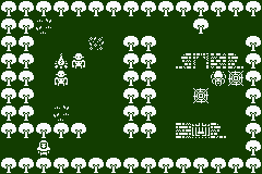
I took another look at the tileset I picked out, the 1-Bit Pack by Kenney. There were several wall, ground, and creature tiles, as well as a few projectiles, so I decided instead to make some kind of action defense game.
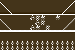
For this new design, I took some inspiration from the Dead Trenches in Dragon Age: Origins. When the player enters that area for the first time, they encounter a group of dwarves fighting darkspawn on a bridge. Further, I thought it would be kind of funny to make a literal tower defense game, so I jumped onto Tiled and designed a simple horizontal map consisting of a bridge and a tower. Enemies would cross the bridge to attack the tower, and the player would shoot at the enemies. There would be a scoring system, different attacks, maybe even some upgrades... The perfect scope for the jam (or so I thought)!
Implementation
This is a real comment I wrote in the main game scene file.
/**
* This variable exists solely to work around the fact that I didn't know how
* to architect parallel scenes because I was a total Phaser 3 noob. It has a
* sibling variable in the UI scene called `initialized` that is set to true
* only when that scene's init method runs. This way, we can display the tower
* health bar even when the two scenes don't initialize in the correct order.
*
* I hate this hack. It makes me sad that I have to resort to such debauchery,
* such an abominable perversion of software engineering that I had thought
* myself above. But no... time crunch, that oldest of programming's enemies,
* reared its despicable head, put me into a clown costume, and forced me to
* write this mockery of good code.
*
* I am sickened (though that's probably just the sleep-deprivation).
*/
I think it's safe to say that making a game in ten days was stressful. Making a game in a game engine I've never used before* at the same time? Perhaps that was an act of hubris. I struggled a lot throughout the entire submission period. My process went something like this:
- Come up with an idea
- Research how to implement it in Phaser
- Fail either because of my ignorance of the engine or my rusty Typescript skills
- Do more research
- Write a hacky workaround
- Repeat
It. Was. Messy. Needless to say, I made several mistakes. Here are the biggest ones:
- I spent a multiple days working on a component system similar to Unity's MonoBehaviours. I did this to appease to my software engineer instincts to favor composition over extension. I was able to build such a system thanks to some great tutorials by Ourcade, but at the cost of several days of work.
- I decided to use a 240×160 resolution (the same as the orignal Game Boy). I thought it would be nice to work with a smaller resolution to limit the amount of tiles I had to work with. The resolution could also be divided evenly with the 16×16 tileset I was using. However, it turns out that Phaser doesn't render text well at that resolution. I ended up having to manually create sprites for all the text in the game using Paint.net. It was about as tedious as it sounds. Furthermore, the low resolution made sprite movements look jerky and caused some of the health bars to merge together.
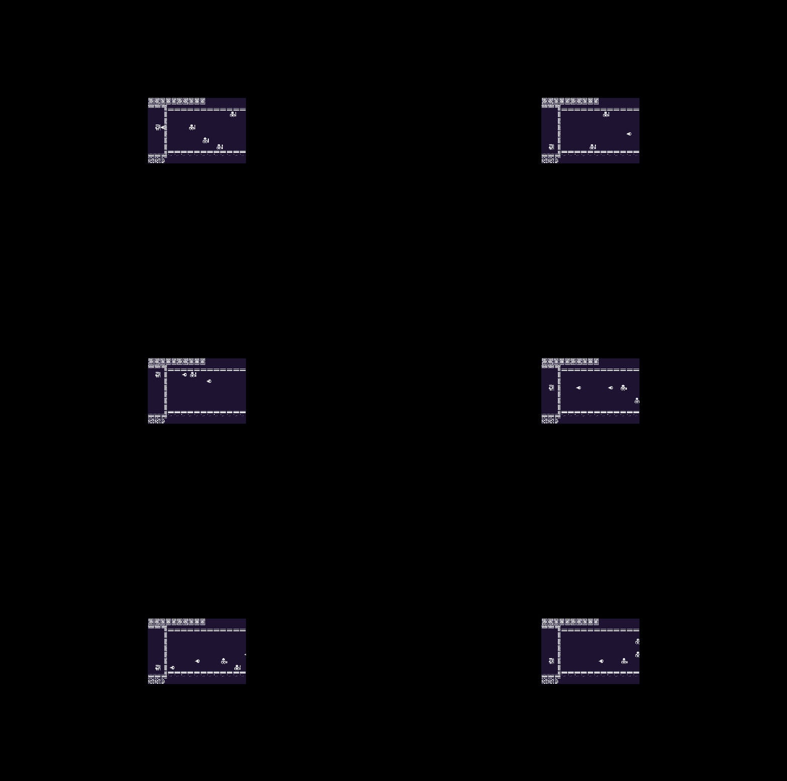
With auto-scaling disabled, the game is extremely small. - I created a separate UI scene that runs concurrently with the main game scene. I alluded to this in the code comment previously, but it seems that Phaser's scene manager doesn't call the lifecycle methods of scenes in the same order across scene restarts. To work around this, I made my scenes play hot potato by polling each other's member variables in their update methods. This made it a headache to follow the flow of execution as logic was split between the two scenes.
Despite these mistakes, I also managed to do some really neat things that I'm quite proud of:
- I didn't want to use Phaser's built-in rectangles for the enemy health bars; I wanted them to look like they belong in the game. To that end, I made separate spritesheets for each of the health amounts. The health component I attached to each enemy updated which frame of the spritesheet was visible based on their current health.
- I created an enemy spawning system that was extensible and surprisingly easy to use. It consists of an spawner class, some enemy templates, and a wave and a level template. The spawner class takes in an array of levels, reads the waves for each level, and instantiates enemies based on the enemy templates. Adding levels was as simple as appending an extra object to the levels array.
- I created unique movement patterns for each of the enemy types. The simplest was the skeleton, which is just a single tween across the map. The ghost was a bit more complex, consisting of a series of tweens to make it move up and down as they crossed the map. The golem was my favorite because I wrote a function to generate a series of tweens that make it look like it's lumbering forward one step at a time.
I ended up with a playable game about one day before the submission period ended. During the last day, I asked for some feedback on the game in the GameDev.tv Discord server. I'm really glad I did this because I discovered that there was an issue where some of the audio files weren't being loaded properly on the first boot which caused the game to freeze at the loading screen. I think this was due to some of the audio file folders having whitespaces in their names. I modified the folder structure to remove the offending folders, and thankfully that seemed to fix the issue. I had zero complaints about freezes during the rating period.
*Okay, full transparency: I did use the previous major version of the engine, Phaser 2, for the final project of my game programming course in college, but that was years and years ago! I haven't done anything Phaser-y until this game jam, and Phaser 3 is significantly different compared to the Phaser 2.
The Rating Period
During the rating period, I tried to rate as many games as I could. I played the games of all the people who commented on my game as well as a few that caught my eye. This turned out to be a lot more work than I expected because I made sincere efforts to give actionable feedback to the creators of the games. I made sure to comment what I liked and mention one or two things I thought could be improved. In the end, I only got to rate 51 games--about 7 games per day.
I tried to stay away from the super popular games because I thought that they had enough feedback. While looking through the games with fewer ratings, I discovered some gems:
- The Last Stand on the Left is a game about serving cookies to monsters. I love its intro sequence, and its atmosphere is just chef's kiss.
- Ode to Earth is a game about organizing a time capsule of human history to be sent to space after the fall of humanity. I love how it uses music in its main mechanic of sorting historical events, and its story is one of the most compelling I found in the jam.
- Don't Fall sees you playing as a leaf trying to hang onto its tree during autumn. I was happily surprised to see a rhythm game submission in this jam. Not only that, but the art and sounds are so cute!
- The Last Night on Crab Island is a cozy hidden object game in which you explore an island where a group of thieves made their last stand. I absolutely adored the environmental storytelling in this game, and seeking out the cute crabs and the sneaky shells was a lot more fun than I expected.
As for my game, I was surprised by how many ratings it got. Even more surprising was how positive the feedback was. I didn't think my game was all that great; it was functional, sure, but it was nothing special. I felt like the positivity was... disproportionate? I guess that it was just a case of impostor syndrome, because at the end of the week, I discovered that my game ranked incredibly highly. My game was in the top 10% of games in six of the eight categories!
Post-Jam Updates
Summary
- Increased the game's base resolution from 240×160 to 960×640.
- Added a level tracker at the top-right corner of the game screen.
- Updated the tower health bar sprite to better convey "half-health" units.
- Made the ghost's movement speed more consistent.
- Remade the main menu.
- Added volume adjustment menu.
- Added pause menu.
Context
In between playing and rating other people's games, I did some research on Phaser to try to address issues in The Wizard Tower. Some of the issues were left over from the development, while others were brought up as feedback during the rating period. Here are some of the lessons I learned:
Cameras
Cameras are Phaser's way of rendering the game world to the canvas. Multiple cameras can be active at the same time, and each is independent of the others. With this knowledge, I took the plunge and increased the game's resolution to 960×640. To compensate for larger viewport, I increased the game scene's main camera's zoom to 4 and scrolled the camera to maintain the original framing of the game. The result is that the game world remains the same scale, but the camera now has 16 times as many pixels to work with. Enemy movement is now much smoother.
Thanks to the independent nature of each camera, I chose not to similarly zoom and scroll the UI scene's camera. Instead, I scaled up the sprites in that scene and readjusted their positions. I did it this way because Phaser renders text in the game world. The antialiasing done on text means that zooming in on small text makes it appear very blurry. By maintaining the camera's scale at 1 and scaling up the text's size, the antialiasing is much less pronounced.
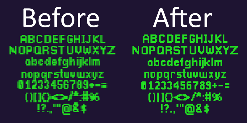
I originally planned to just use this method of large text sizes to redo my UI and menus, but I discovered another way to address the blurry text issue that worked much better.
Bitmap Text
I learned about Bitmap Text while investigating ways to fix the blurry text issue caused by the low resolution. Instead of rendering text using a font file (e.g. a TrueType font), Phaser can take in an image file with all the characters you need and an XML file containing data about each character such as its location on the image, its width and height, and how much space is needed before displaying the next character. Phaser then combines the two and renders sprites for each character. Combined with the pixelart game config property, text can be rendered quickly and with no antialiasing.
While researching bitmap text, I came across Bitmap Fonts (PNG + XML), an asset pack containing some simple bitmap fonts made for Phaser. I tried some of them, but they didn't really match the style of the text I previously used. Rather than keep searching for a bitmap font I liked, I opted to make one myself.
I used the files in the asset pack as a jumping off point. I copied over all the text sprites included with the 1-Bit Pack into a grid. Since the 1-Bit Pack only provided a subset of the characters, I had to create all the lowercase characters and several punctuation marks. Then I modified one of the XML files to match the larger dimensions of my font. After a lot of trial and error, I created a font that I am really happy with.

The new font allowed me to replace all the images I originally used for text and to quickly create new UI elements and scenes.
Ghosts
Although the vast majority of comments I received about the difficulty of the game praised how balanced it was, a few players also felt that the game was too difficult. I wanted to address this, as I didn't spend as much time as I wanted tuning the difficulty prior to submission. The ghost was an easy target for some adjustments as it had a small bug in the jam submission that affected its difficulty.
The ghost is unique among the enemy types in that it moves vertically as it travels across the map. To accomplish this, I programmatically created three waypoints across the bridge. The X coordinates for these waypoints were fixed, but the Y coordinates were based on the starting position of the ghost. I just reflected the starting Y value across the midline of the bridge to get the next waypoint's Y coordinate. The further away the ghost starts from the midline, the greater the distance it travels vertically. This is fine on the whole, however, Phaser's tween system requires tweens to play for a certain duration. Since I set the duration of each tween to be 3 seconds long, ghosts towards the top or bottom of the bridge moved faster than those closer to the midline.
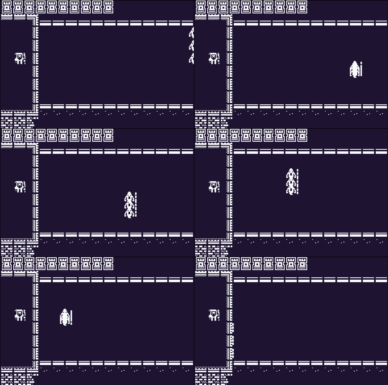
I updated the movement template to calculate the duration of each tween to change based on a constant speed. Now, ghosts move at the same speed regardless of their initial distance from the midline.
This new constant speed is a bit lower than the original speed of the ghosts in the two lanes furthest from the midline, so the overall difficulty should be lowered.
Menus and UI
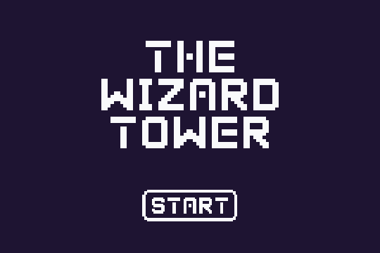
The submission had a barebones main menu containing only the game's title and a start button. It also lacked any way to pause the game.
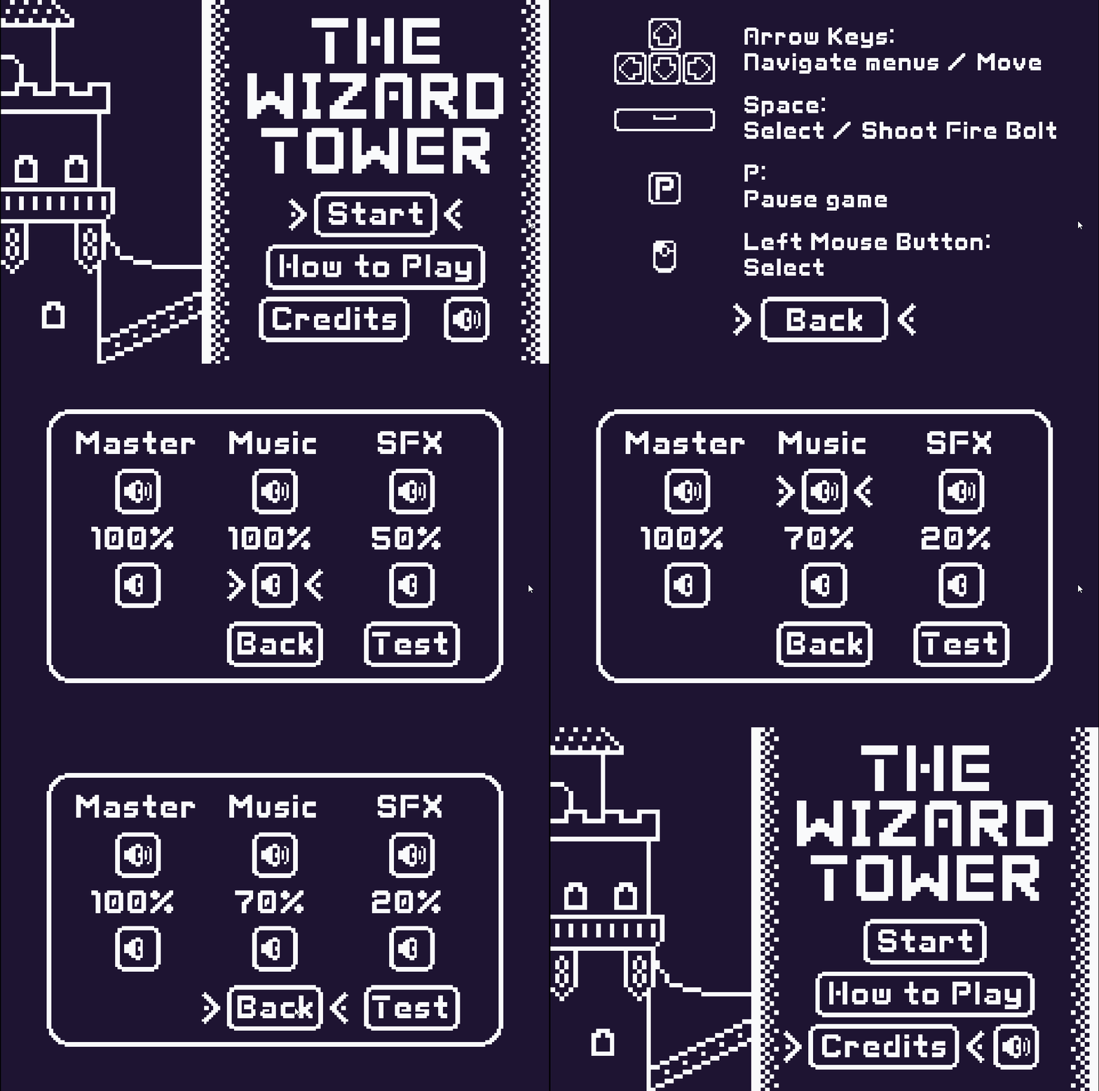
I addressed these by essentially redoing the entire menu system. I created a new main menu background using the art on the Itch.io game page and added buttons to access new scenes.
I recently came across the Game Accessibility Guildlines website, which outlines ways to make video games more accessible. One of the basic requirements is to ensure all areas of the user interface can be accessed using the same input as the gameplay. Since the game is played with a keyboard, I made the entire menu system navigable using only the cursor keys and spacebar. I didn't drop mouse support, however!
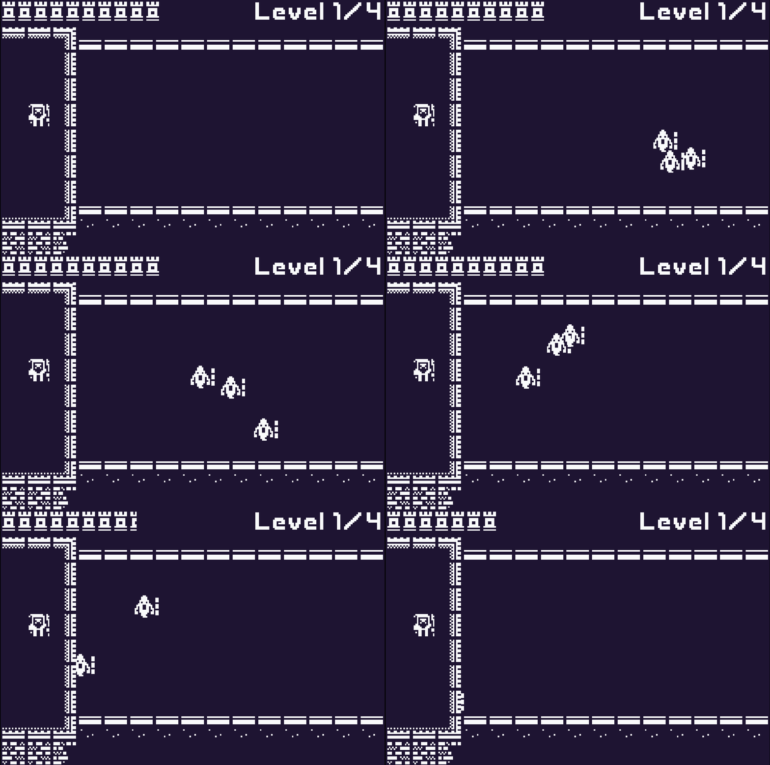
Lastly, some players wanted a way to see their progress through the game, so I added a small level tracker to the top-right corner of the game. I also went ahead and changed the tower health bar. The original sprites I used weren't actually bad; I just thought that they took up a bit too much space, and the tower outline didn't clearly convey half-health values the same way as a tower cut in half.
Conclusion
This past month had a lot of firsts for me. I participated in my first game jam. I made my first game in Phaser 3. I published my first game on the internet, for which I got my first player feedback. It's a lot, and I am so grateful I did it all. I've played video games for as long as I can remember, and I dreamed of making games since I wrote my first line of code. This game jam gave me the push I needed to take another step towards that dream.
As for The Wizard Tower, I think I am done working on it. It's not as complete as it could be. I haven't explored additional gameplay mechanics and the UI and gamefeel can definitely be improved. However, I have learned everything I wanted to learn from it, and my brain is itching to get started on a new project. There is no shortage of game jams coming up, and I've been meaning to learn Godot, so I'm excited to keep going and see what the next few months will be like.
Leave a comment
Log in with itch.io to leave a comment.